Create Your First Project
Start adding your projects to your portfolio. Click on "Manage Projects" to get started
Hermanus Whale Festival
Brand and Wayfinding
2025-03-18
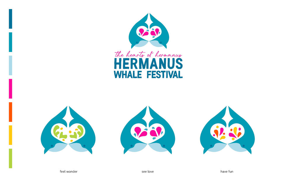
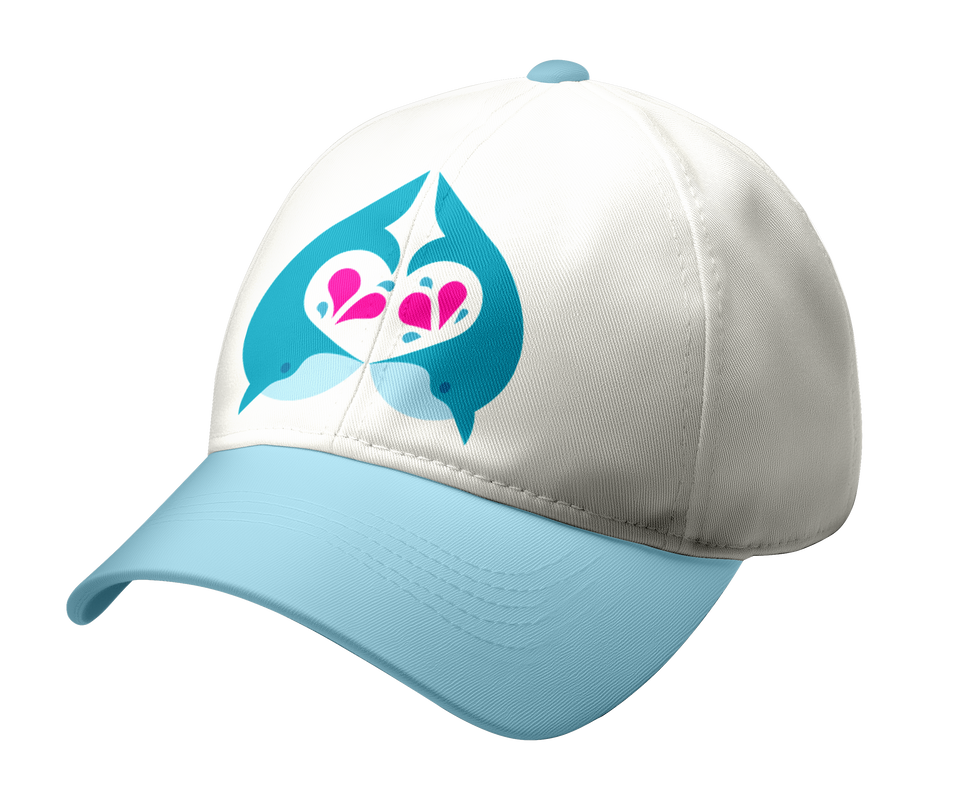
The Hermanus whale festival is a huge annual festival on the coast of South Africa. In contrast to its current branding, I implemented a fresher colour scheme, new brand artwork and typefaces, to highlight the springy, joyous, and open feel the festival promotes. The migrating whales the festival celebrates are the only type that have their blows look like hearts and could be called “The Hearts of Hermanus”.
The three logos represent the core pillars of the festival’s brand: See Love, Feel Wonder, and Have Fun. The changing shapes within the whales represent the public’s love for them, the wonder for the ocean, and the excitement that defines the festival. The icons paired with the logos symbolize key aspects of the festival; The eco-marine learning centers, the gift and craft stalls, and the lively events, each are accompanied by a conceptual slogan. The voice of the brand is also brought out in different extensions of the icons. Make a noise, dive deeper, and splash around, have been extended for various purposes on banners, and posters.


